Excerpted from “On the Porch” by Sandee Mahoney and James Crisp
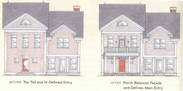
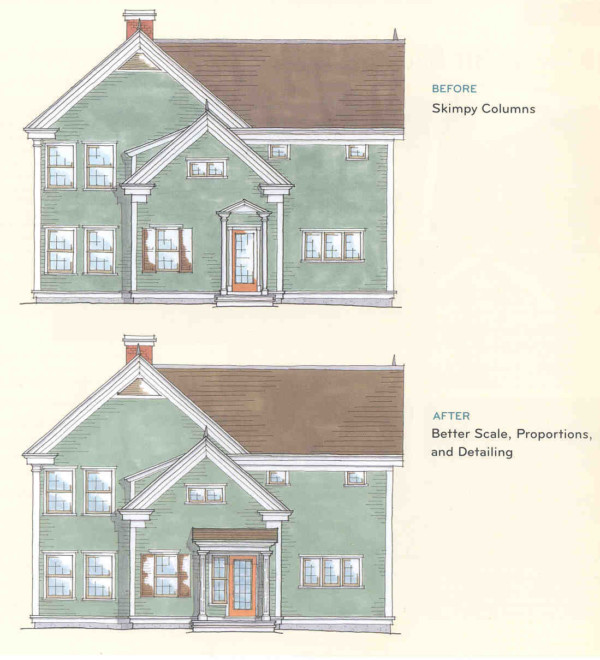
Have you ever looked at a house and sensed that something about it wasn’t quite right? Perhaps it didn’t look finished or feel balanced. Was it the placement of the windows? The pitch of the roof? The size of the porch? It’s not always easy to put your finger on what’s wrong, but it helps if you understand a few principles of good design. These drawings illustrate the difference between porches that are appropriately placed and in good proportion to the house-and those that aren’t.
1. a) How awkward a big, boxy house looks with a microscopic portico attached.
b) How a house and porch are balanced when they are in proportion.
2. a) How skimpy undersized columns can make a porch look tacked on.
b) How a wide header and substantial columns appear to support a facade.
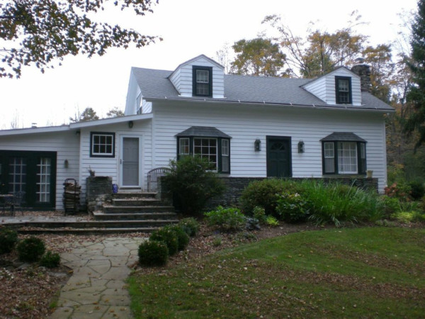
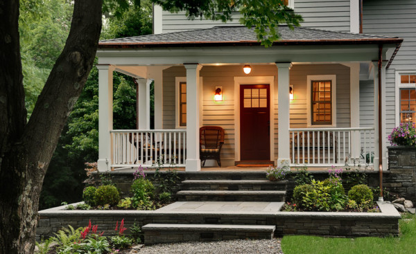
I freely admit that before and after photos used to illustrate a point is like shooting fish in a barrel, but here I go. The before shot shows the entry to a home we renovated and the after shows how no one could mistake where to enter this home. The home now has curb appeal and a presence when you approach the front door.




If you’re interested in more on this topic, read Marianne Cusato’s “Get Your House Right: Architectural Elements to Use and Avoid.” Fantastic topic!