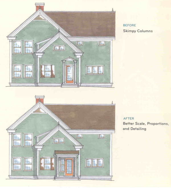
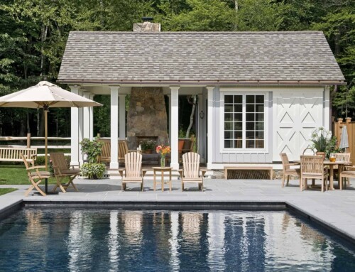
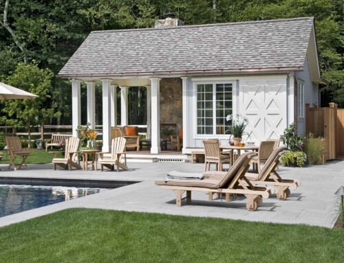
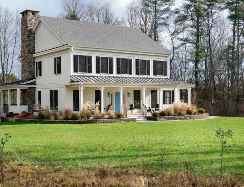
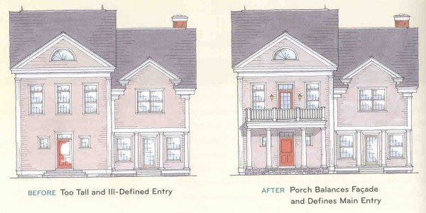
 Have you ever looked at a house and sensed that something about it wasn’t quite right? Perhaps it didn’t look finished or feel balanced. Was it the placement of the windows? The pitch of the roof? The size of the porch? It’s not always easy to put your finger on what’s wrong, but it helps if you understand a few principles of good design. These drawings illustrate the difference between porches that are appropriately placed and in good proportion to the house-and those that aren’t.
1. a) How awkward a big, boxy house looks with a microscopic portico attached.
b) How a house and porch are balanced when they are in proportion.
2. a) How skimpy undersized columns can make a porch look tacked on.
b) How a wide header and substantial columns appear to support a facade.
Excerpted from “On the Porch” by Sandee Mahoney and James Crisp

